
Customers often compare a push-through cabinet with a set of channel letters because both create illuminated, dimensional copy. The fabrication and installation are quite different. One starts with a shared cabinet face; the other is a set of separate letters. That single distinction drives most of the practical differences below.
The Core Difference
| Feature | Push-Through Signs | Channel Letters |
|---|---|---|
| Structure | Acrylic letters or graphics set into one routed aluminum face | Each letter individually fabricated, with its own return and back |
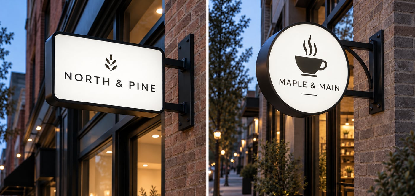
| Mounting | Typically integrated into a sign cabinet | Mounted directly to the building or on a raceway |
| Visual effect | Letters physically protrude through the face for a raised 3D look | Each letter is a standalone illuminated dimensional shape |
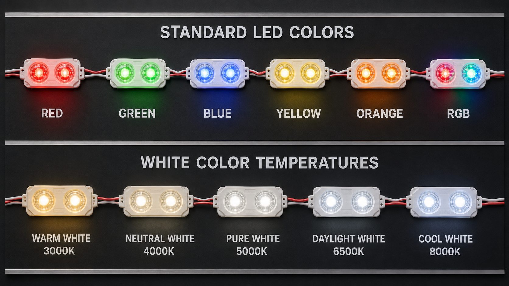
| Illumination | LEDs illuminate the acrylic face, exposed edges, or both | LED modules inside each letter body, front-lit, halo-lit, or both |
| Typical use | Banks, hotels, corporate offices, premium retail — often a cabinet feature | Standard storefront identification for retail, restaurant, and commercial accounts |
Push-Through: Letters Set Into a Single Face
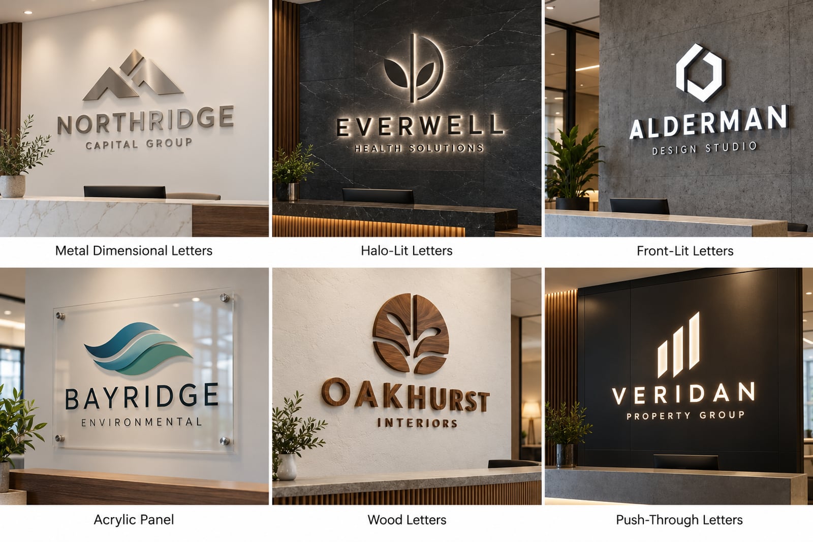
Push-through signs feature thick acrylic letters or graphics precisely inserted through a routed aluminum sign face, so the acrylic physically protrudes for a striking dimensional effect. Internal LEDs can illuminate the face, the exposed edges, or both, and opaque vinyl or paint can be applied to specific surfaces to control exactly where light shows. Push-through letters are commonly integrated into an illuminated sign cabinet face rather than sold as a standalone product, and they're a frequent choice for banks, restaurants, hotels, corporate offices, and premium retail locations where a sophisticated architectural look matters more than maximum visibility from a distance.
Channel Letters: Individually Fabricated and Mounted
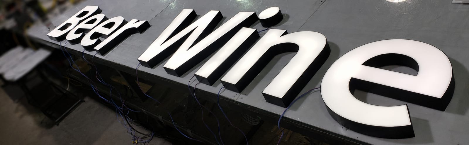
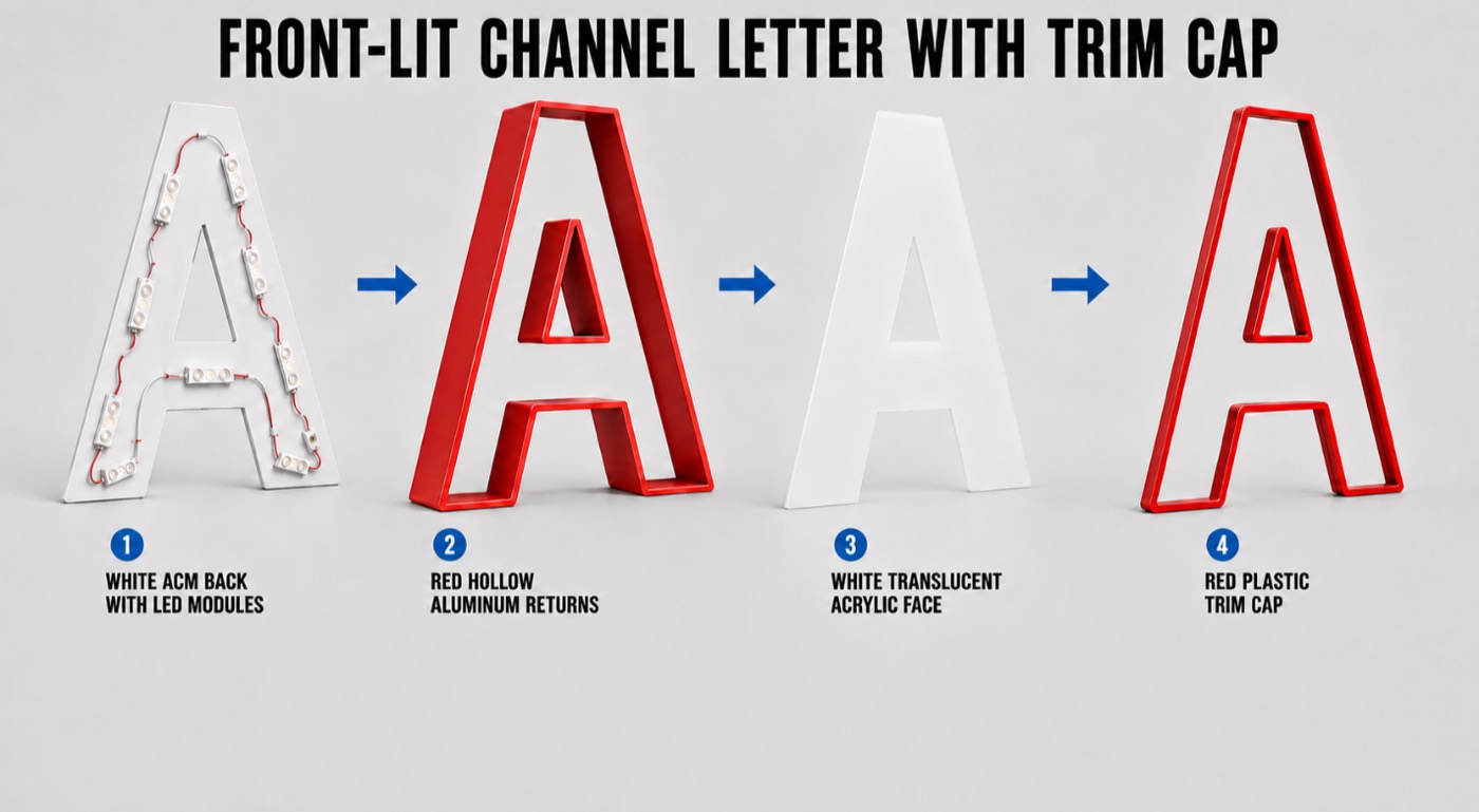
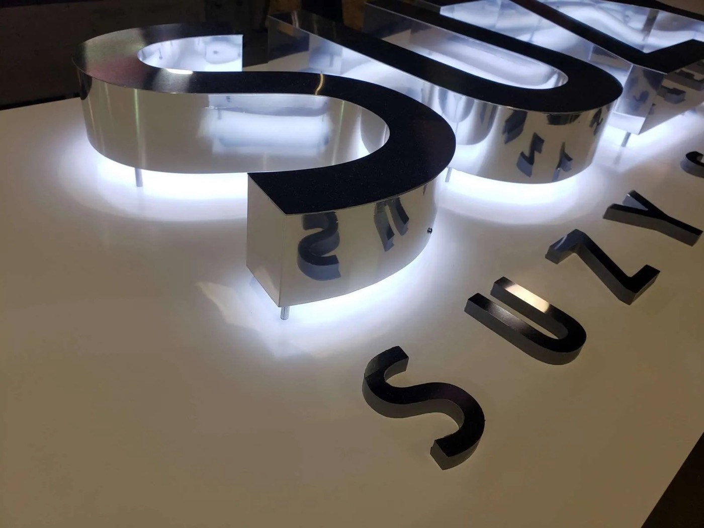
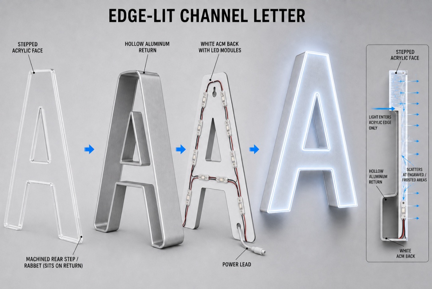
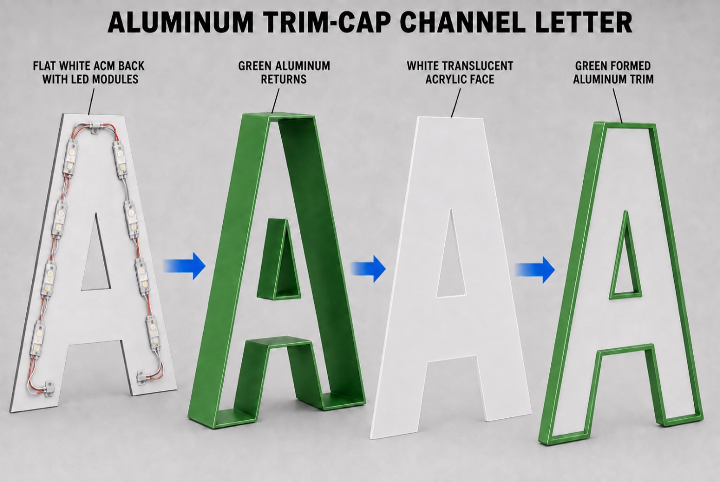
Channel letters are three-dimensional, individually fabricated letters — each with its own metal returns and an illuminated acrylic or polycarbonate face — mounted directly to a building façade or pre-wired to a raceway. This is the standard storefront identification sign for retail, restaurant, and commercial accounts, and one of the most frequently quoted products a sign company sells. Illumination options range from front-lit to reverse halo to front-and-back-lit, and construction can be trim-cap, trimless, edge-lit, or side-lit depending on the desired look.
Which One Should You Quote?
If the project needs maximum storefront visibility and the classic three-dimensional letter look, channel letters are the standard answer — they're built for exactly that. If the customer wants a more subtle, architectural dimensional effect as part of a sign cabinet or building-integrated face — common in banking, hospitality, and corporate lobby signage — push-through is the better fit. The two aren't mutually exclusive on a single project: a building can carry channel letters for primary identification and a push-through panel for a directory or secondary feature.
Push-Through Signs vs. Channel Letters FAQ
Are push-through signs a type of channel letter?
No. Push-through letters are set into a single routed aluminum sign face, typically as part of a sign cabinet — they physically protrude through the face for a raised, dimensional effect. Channel letters are individually fabricated, each with its own return and back, mounted directly to the building or on a raceway.
Can push-through signs be part of a larger sign cabinet?
Yes. Push-through acrylic letters or graphics are commonly integrated into an illuminated sign cabinet face rather than sold as a standalone component.
Which one is more common for storefront signage?
Channel letters are the standard storefront identification sign for retail, restaurant, and commercial accounts. Push-through signs are more often specified for a specific architectural or premium-brand effect, frequently as part of a cabinet rather than a full building-scale letter set.